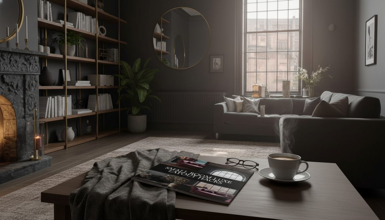
Small rooms can look expensive and feel calm when the layout supports movement, light, and everyday habits. The quickest “upgrade” usually isn’t a new sofa or a bold paint color—it’s a placement plan that makes the room feel intentional. Below is a practical, digital-first walkthrough: simple measurement habits, luxe-looking placement rules, fast fixes for common small rooms, and a realistic way to use AI tools without getting tricked by bad scale.
In tight spaces, luxury reads as ease. When the room flows, the finishes look richer because your eye isn’t fighting clutter or awkward paths.
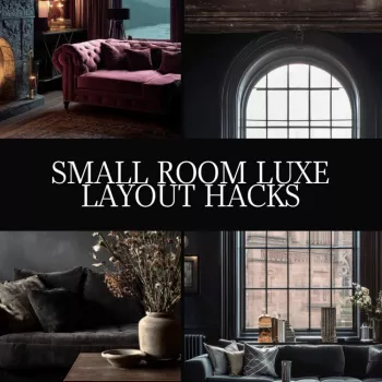
If you want a step-by-step, printable process (plus AI-friendly templates), the Small Room Luxe Layout Hacks digital download guide is built for quick planning without renovation-level effort.
Small-room “oops” are usually inches, not feet. Measuring up front keeps you from buying pieces that block doors, crush walkways, or swallow light.
For clearance and functional planning basics, the National Kitchen & Bath Association (NKBA) planning guidelines are a helpful reference point—even beyond kitchens and baths—because the logic of movement and access applies everywhere.
A simple vertical upgrade that doesn’t eat floor space: add a wall shelf to turn an “empty” wall into a styled storage moment. The rectangular wooden wall hanging shelf works well above a desk, beside a bed, or near an entry for a tidy landing zone.
| Area | What to protect | Practical target |
|---|---|---|
| Main walkway | Uninterrupted path between entry and focal zone | Keep it the clearest route; avoid placing furniture corners into it |
| Seating zone | Knee and reach space for tables | Choose slimmer tables; prioritize easy reach over extra surface area |
| Bed access | Daily movement and linen changes | Keep at least one side easy to access; use wall-mounted options to save inches |
| Door swings | Full opening without collisions | Leave door arc clear; relocate floor lamps and baskets out of swing zones |
| Window wall | Light and air movement | Keep heavy storage off this wall; use low-profile pieces if needed |
Consistency matters when you’re switching between tape, apps, and AI. If you want a deeper rabbit hole on measurement standards and why uniform units reduce errors, NIST is a reliable authority on measurement practices.
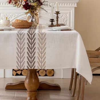
For dining nooks and multipurpose surfaces, a single cohesive textile can “organize” the visual field. An embroidered tassel cotton linen tablecloth can help a small table look styled (even when it’s doing double-duty as a desk).
If you want more small-space inspiration and examples of how designers handle tight footprints, Architectural Digest is a solid source for layout ideas and visual reference.
Rework the main walkway so the room is easy to move through, remove one bulky or redundant item, and anchor the space with a single focal wall. Then upgrade placement: hang curtains higher and wider, keep surfaces partially clear, and align rug and furniture edges so everything looks deliberate.
Use AI to generate multiple layout options, but input constraints first (door swings, window locations, and must-keep furniture). After that, validate the best option with real measurements and a painter’s-tape footprint so you don’t end up with blocked openings or incorrect scale.
Include measurement steps, clearance rules, and ready-to-use templates for common rooms like studios, bedrooms, and living rooms. It should also cover troubleshooting for tricky shapes and a repeatable workflow that turns AI ideas into a plan you can actually live with.


Leave a comment